<strong>Retro style branding</strong> sells. <strong>It uses color, type, and storytelling to trigger nostalgia and clear brand signals while creating...
Retro Style Branding: How to Design Nostalgic Brand Identities That Sell
Retro style branding sells. It uses color, type, and storytelling to trigger nostalgia and clear brand signals while creating measurable revenue streams and ROI when tied to automation and a scalable business model.
Key Takeaways
- Retro Style Branding uses color palettes, typography, and consistent visual systems to build emotional resonance and improve conversions.
- Prioritize brand consistency, packaging, and point-of-sale experience to turn nostalgia into repeat customers.
- Measure ROI with customer lifetime value, conversion lift tests, and operational automation to scale profitably.

What is Retro Style Branding?
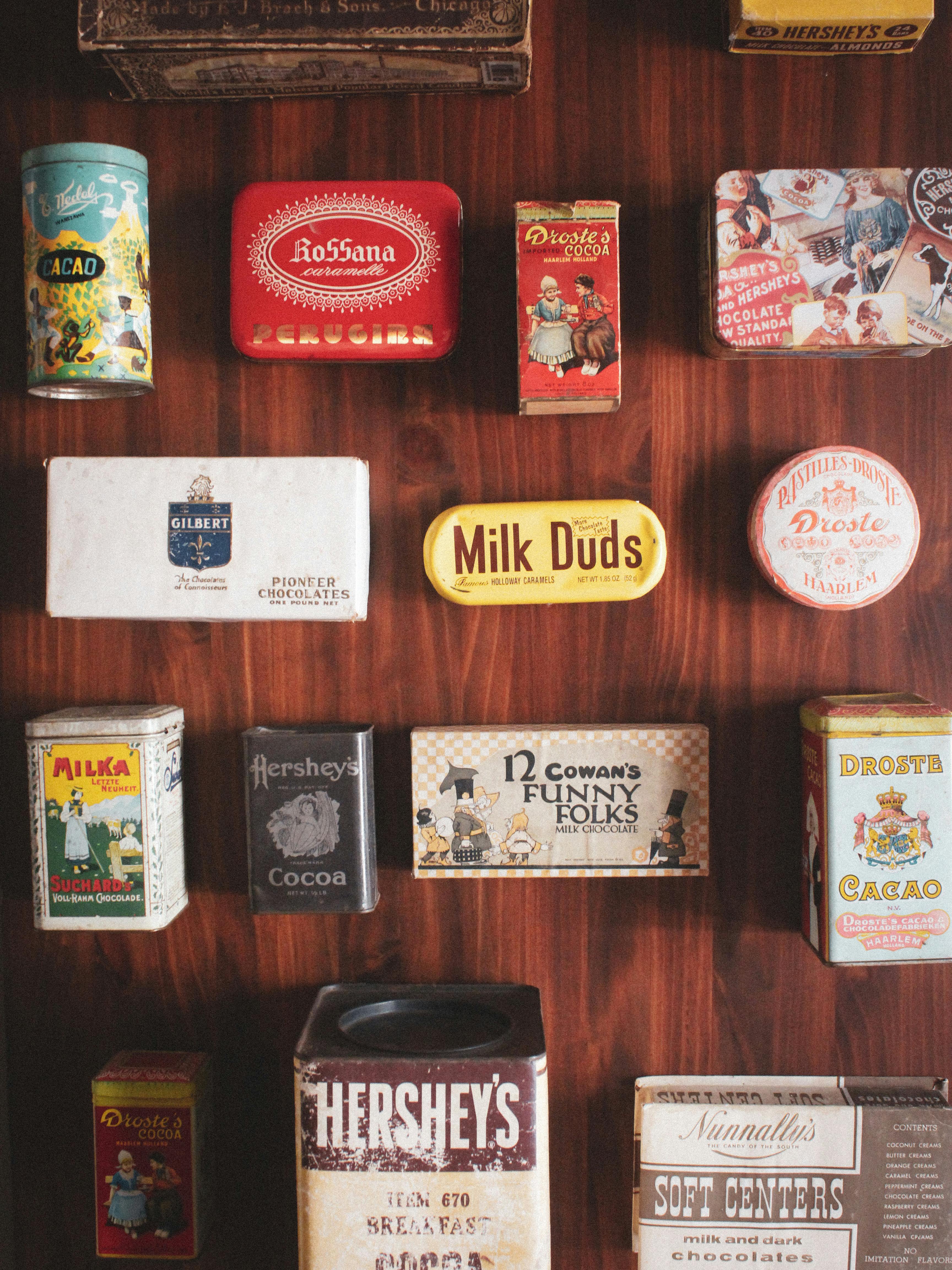
Retro style branding is intentional, not accidental. It references historical art, typography, and production techniques—using them as signals to the customer that your product has heritage or personality, which often raises perceived value and trust when executed well, and yet it must tie into a clear business model or the aesthetic becomes mere costume design that costs more than it returns. This is about rules and restraint.
Pick a narrow historical reference and then systematize the choices. Define a color palette, two headline typefaces and one body typeface, a photography treatment that repeats, and a tone of voice that reinforces the era; after you set those rules, build templates for packaging, product pages, and ads so the brand behaves like a single organism and supports consistent, measurable revenue streams. Yes, the visual system must support operational scaling and be compatible with automation tools.
What matters is coherence.
Core Benefits and Importance
Short attention spans punish inconsistent brands. A consistent retro system—colors, typography, photography, and voice—creates memory structures that improve conversion rates and encourage repeat purchases when the product actually meets customer needs, and the measured result is better ROI and higher customer lifetime value rather than a momentary like or share. The aesthetic is only useful if it supports a clear value proposition and improves the entire customer funnel.
Retro visuals give you three practical advantages: perceived value premium, standout positioning among generic competitors, and creative moat that supports pricing power; however, the real benefit is operational: these visuals become a lever for targeted acquisition when paired with template-driven ads and packaging workflows that let you scale without losing fidelity. That’s the part most guides gloss over.
Measure relentlessly.
Step-by-Step Implementation Guide
Start by auditing your current assets. Pull your logos, hero images, packaging work, and store pages into a single folder and score them on three things—consistency, readability, and reproduction cost—because a beautiful typeface that doubles printing costs is not a success metric unless it improves margin enough to pay for itself. Be practical.
Choose one era as your primary reference—1950s diner, 1970s groovy, 1980s neon, or art-deco modern—and then set three anchor rules: a limited palette with primary and secondary colors, a type stack with one expressive headline and one neutral body face, and a photography/illustration treatment that can be templated for product shots and social posts, and build modular templates for your ecommerce pages and ad creative so you can automate creative production and A/B test quickly. I’ve analyzed dozens of brand repositionings and the winners were the ones who combined strong visuals with an operations plan and measurable KPI targets like conversion lift and CLTV improvement.
Ship slowly and measure each change.
Comparison Table
Here’s a direct comparison so you can decide which route fits your product and team.
| Feature |
Retro Style Branding |
Modern Minimal Branding |
| Emotional pull |
High, nostalgia-driven |
Lower, clarity-driven |
| Visual complexity |
Rich palettes, textures |
Limited palette, whitespace |
| Perceived price |
Often premium if authentic |
Often premium when paired with craft |
| Best for |
Lifestyle, food, fashion, niche goods |
Tech, high-end services, luxury goods |
| Scalability |
Requires template automation |
Easier visual scalability |
Common Mistakes to Avoid
Copying decorative elements without a system makes your brand look indecisive and amateurish. Randomly slapping a mid-century pattern onto modern product photography, or using unreadable novelty type on small labels, will tank conversion and return on ad spend faster than you can print the next batch of stickers, so don’t be cute at the expense of usability. Be conservative with decorative choices.
Most 'retro' makeovers fail because they ignore distribution, ROI, and experience consistency. The real culprit is treating the visual as the product rather than part of a business model that must deliver profit and dignity of work for the team, which is why ethical stewardship of resources and transparent pricing matter for long-term success. Aim for clear rules, not an aesthetic theme park.
Avoid vanity execution.
Frequently Asked Questions
Q: Is retro branding only for physical products?
A: No, it works for services and digital products when the visuals support a clear value proposition and the business model measures ROI; retro cues can signal approachability, trust, or premium craft depending on how you use them, so test visuals against conversion metrics.
Q: How do I choose the right era?
A: Choose an era that aligns with your product values and audience memories, then ensure the era’s visual language doesn't conflict with readability or production costs; if your target market is young, favor eras they have nostalgic associations with through media, not just calendar time.
Q: Can I mix retro with modern elements?
A: Yes, but do it with strict rules—use retro for primary cues and modern systems for usability and accessibility, and automate templates so the mash-up stays consistent across channels.
Final Thought
Retro style branding can be profitable when it is purposeful, consistent, and measured against real business metrics like customer lifetime value and conversion lift. Treat your visual choices as stewardship of assets rather than decoration, keep moral clarity about honest messaging and the dignity of work, and remember that long-term brand value is built by treating customers and teams fairly rather than short-term gimmicks. This is both good business and a form of ethical stewardship.
If you want practical next steps, audit assets, pick an era, create a rule book, and automate templates for repeatable production; then measure conversion changes and CLTV so your creative work pays for itself. That’s how nostalgic design becomes a reliable revenue stream rather than a one-off vanity project.
References and further reading:
{
  "@context": "https://schema.org",
  "@type": "FAQPage",
  "mainEntity": [
    {
      "@type": "Question",
      "name": "Is retro branding only for physical products?",
      "acceptedAnswer": {
        "@type": "Answer",
        "text": "No. Retro branding works for services and digital products when the visuals support a clear value proposition and the business model measures ROI."
      }
    },
    {
      "@type": "Question",
      "name": "How do I choose the right era for my brand?",
      "acceptedAnswer": {
        "@type": "Answer",
        "text": "Choose an era that aligns with your product values and audience memories, and ensure the era's visuals remain readable and cost-effective to reproduce."
      }
    },
    {
      "@type": "Question",
      "name": "Can I mix retro elements with modern design?",
      "acceptedAnswer": {
        "@type": "Answer",
        "text": "Yes, but establish strict rules: use retro for primary brand cues and modern systems for usability, accessibility, and automation."
      }
    }
  ]
}